Sunday, October 30, 2011

Sure, plastic toys on top of cupcakes are fun, albeit a potential choking hazard, but how much more fun is a cupcake when everything is edible? Way more fun.

These Creepcakes are surprisingly easy with the help of some DoodleBats from ScrapNfonts and some chocolate. Yumm.

Here's what you need to get started: Wax paper, chocolate chips (or better yet, chocolate almond bark if you have it), a ziplock baggie, and a printout of DoodleBats.


In selecting DoodleBats for your printout, make sure you pick images that are solid black with no separate parts. Scale them big enough so they're about two inches tall when printed out. DoodleBats with a lot of good images are DB Boo Ya and DB Haunted House. I also used DB Vintage Halloween.

You can also use any of the Jack-o-Pattern DoodleBats if you remember to use the negative of the image as your template. It helps me to draw a circle around the outside of the image, then I use the white shape as my guide.

I used chocolate chips, but on a hot day the chocolate may not set firmly. Chocolate almond bark would probably work better.

Melt the chocolate. I just did mine in the microwave for 20-30 second intervals, stirring in between just until it was smooth. You don't need very much chocolate, I used about half a cup and had extra. A little goes a long way.

Spoon the melted chocolate into the corner of the ziplock baggie. Try to gently deflate some of the air out of the back before you zip it shut.

Take a sheet of wax paper and lay it over your DoodleBat printout. You should be able to see the DoodleBats underneath it. Now carefully snip a tiny piece of the corner off of the ziplock baggie. If it seems too small a hole, you can always cut more. Hold the baggie like a frosting piping bag, and carefully trace the DoodleBat images in chocolate.

I always like to outline the edges first, then fill them in with chocolate.

Make sure the images you are making in chocolate are thick enough to stand on their own. I went over some of my more fragile looking chocolate lines twice just to make sure they were thick enough.

I really liked the skulls, the spider web, and that funky spooky tree, so I made multiple copies of them by shifting my DoodleBat printout underneath the wax paper.

Make more copies than you think you will need and plan for a couple casualties.

After you've finished piping all the shapes, carefully move the wax paper to a cookie sheet and chill the chocolate until it is solid. Carefully remove the chocolate shapes one at a time by peeling the wax paper out from underneath. Finally, prop them on your cupcakes!

I love the final look!

These creepcakes will be a scream at Halloween gatherings!

If you want an idea that's even more quick, printed DoodleBats can make great cupcake toppers with some markers, a toothpick and a little tape or glue.

These were made with DB Circles - Halloween and the tombstone on the right was made with SNF Dagger.

I love these little pirate flags. All three of them are in DB Pirate (the sneak peek product for this month).

The creepy printed decor can work as a cupcake wrapper, too. You can make your own with fonts and DoodleBats (the one below features LD Jambalaya) or LetteringDelights.com has a lot of pre-made cupcake wrappers to choose from.

Whatever you do, make it fun, make it crafty, and make yourself a Happy Halloween!

Shop ScrapNfonts.com for the widest variety of craft and scrapbooking fonts, DoodleBats, WordArt and Brushes.

Thursday, August 4, 2011

I have a new obsession. I can't stop myself from making t-shirts with iron-on transfers.

What sparked this obsession you may wonder? It was the discovery of iron-on transfer paper that I can print out from my own printer!

If you haven't used this, you may be as skeptical as I was when I first saw it. Psh, that won't last through one wash! It will peel and crack and look TACKY. That's what I used to think. I'm here to tell you if you do it right, it will last and can look awesome.

My first shirt was for my husband who wanted a shirt to honor his favorite basketball player. He wears it all. the. time. We've washed it over and over and it still looks great (and feels softer with each wash).

Making a shirt

I decided I wanted St. Patrick's Day shirts that we could wear past St. Patrick's Day, too. That is where this tutorial begins. Enter SNF Jolly Curls, SNF Sophia and DB Lucky Trinket in fun, lucky designs.

First rule: before you print your design onto the transfer paper, make it a mirror image because you will be ironing it face down. Most design programs will let you do this or your printer may have a reverse or mirror image setting.

Next, cut out your image with a narrow margin around it. Try to keep corners rounded.

Here is when the nit-picky details make a difference. First, drain all the water from your iron and let it heat up for 5 minutes to evaporate any moisture. Don't take out your ironing boards. These transfers need a hard flat surface that can trap the heat between the iron and the surface. The instructions recommend veneer or laminate countertops covered by a pillowcase. I can do that.

Iron the pillowcase and your shirt (or fabric if your not doing a shirt) to make sure they are flat and free from moisture.

Then place your image face down how you want it on your fabric.

Push hard on your iron, with two hands, and slowly move the iron back and forth, up and down over your paper. Pay close attention to the edges. Make sure they get lots of heat and pressure. It should take 1-2 full minutes of slow pressured ironing to make sure you've got it.

Let your shirt cool for about two minutes and then carefully peel back the paper and reveal your creation! This is the exciting part.

Woo Hoo! It worked! (I haven't had it fail on me yet, but it's still exciting every time it works.)

I'm pretty pleased with my two St. Patty's shirts. If you like these designs, you can find slightly scaled down versions in this collection of Lucky Word Art at SNF.

Just so you know I'm not just making this obsession up, here is a sampling of some of the shirts I've made in the past few months.

I've burned through at least two packages of transfer paper. Good luck, and beware. It's funner to make these than you may think, and oh so easy.

Shop ScrapNfonts.com for the widest variety of craft and scrapbooking fonts, DoodleBats, WordArt and Brushes.

Monday, August 1, 2011

Hand-drawn lettering, hatchings, scribbles and doodles are fun styles of lettering that are super popular. These playful elements add a youthful feel, you've probably noticed them lately in advertisements, catalogs and magazines. Capture the same look on your scrapbooking, card and paper crafting projects with a new bundle of sketch fonts designed exclusively for scrapNfonts by Brian Tippetts!

This month, Brian highlights the new Sketchbook Bundle with project samples and a free download. PS- You can buy the Sketchbook Bundle here for only $10.
______________________________________________________

Font Tip: Let's Play
by Brian Tippetts

In my March tip I talked about many different font styles and ways to find your own font style. In addition, I showed samples in each style to help you get started.

In this tip I am very excited to focus on a new bundle of fonts that fall in the “playful and display” style of fonts. The fonts are all included in the Sketchbook Bundle and are available now at ScrapNfonts.

This “sketch” style of font is very popular now. In fact, just the other day I received two catalogs in the mail that were both using this style of font. This fun, sketchy style is being used to add a fun and youthful feel. The same look and feel is now available for you to use on your scrapbooking, card or papercrafting project.


Included in the Sketchbook Bundle are four different fonts and one DoodleBat font, providing a great opportunity for mix and matching of fonts within the family.

There are many ways to mix and match fonts from the same style or font family. In this case, these fonts all have the “sketch” style and can be mixed together easily. I have created a few different samples of cards and invitations to show you how these fonts could be used.

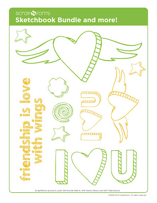
In this first sample, I wanted the design to be simple and youthful. I used an “I” and “U” from SNF Sketch Block and the heart from DB Doodle Sketch. You can see how they can look identical, yet a great way to mix in some DoodleBats into your message. Then I used SNF Sketch Black Out for the text below. Oh, I almost forgot, the photo corners come from the DB Doodle Sketch too.


To create an invitation for an upcoming family picnic, I wanted to create a fun, graphic look. By using SNF Sketch Black Out for the large letters to create “Summer 2010 Picnic” and then the rocks at the bottom, the sketched letters are easy to see and very fun. For the message to attend and the date, time and location, I used SNF Sketchy in all caps. I used “earthy” colors to tie the whole design together and it looks great.


For this card, I wanted to see if I could add my own touch to the fonts. I used SNF Sketchy for the title, then used the same heart as the first sample from DB Doodle Sketch. To customize it, I drew the wings in Adobe Illustrator to add to the heart to go along with the saying. It turned out perfect. I’m guessing that you would love to have the “winged heart” for you own use. Well, you’re in luck, I have included the “winged heart” as part of a fun, free download.


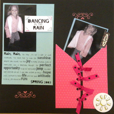
Well, I hope you are excited as much as I am about this new “sketch” collection of fonts. As you can see from this layout by Merrilynne Harrington, they are a blast to use and really add a touch of playfulness to any scrapbook, card or papercrafting project.


Enjoy these playful fonts and please find someone to send a “winged heart” to.

Oh, and PS- Show me the projects you come up with using these new sketch fonts by sharing them in our Idea Gallery.
Brian

Friday, July 15, 2011

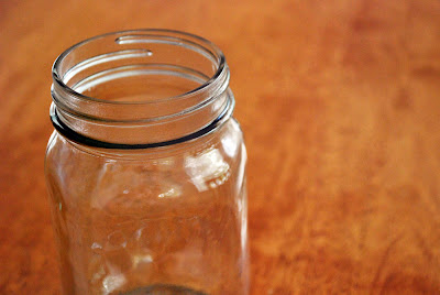
Question: What do you see when you look at this picture?

Answer: Potential! Imagine the possibilities! This jar is just itching to be filled with treats, whether they are for you or to give away. You know what else it's itching for? To be beautifully presented, and that's where I come in.

I have recently discovered the versatility of mason jars and am so excited! They are a fabulous, cost-effective way to create beautiful gifts for the holidays, favors, or just because. Of course, if you can your own jams, sauces or soups, those also can be beautified with a homemade label by you.

After filling my jar, I started with this:

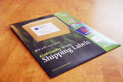
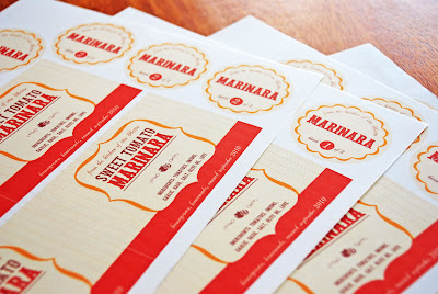
Full sheet sticker paper. They are camouflaged as "shipping labels" but don't let that fool you. They travel through my printer perfectly and I can squeeze at least four jars worth of labels per page if I puzzle them together.

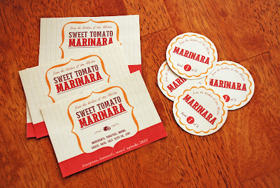
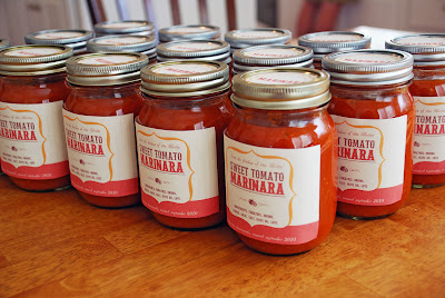
My treat of choice is homemade tomato sauce. Mmmmm. Just thinking about it makes my mouth water and fills me with a happy warm feeling of home comfort. I carefully cut out the printed labels.

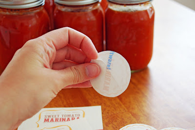
Then I peel the paper off the back of the sticker and carefully place them on my jars. Most of my stickers had a handy diagonal cut through the paper on the back of the stickers so it was pretty easy to get the stickers off. Some stickers needed a little coercion, but they came with a little help.

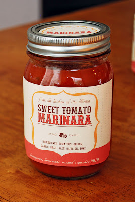
Here is my final shiny happy jar of tomato sauce. Isn't it lovely?

I created the label using LD Petticoat Black for the title, LD Antique for the script at the top and bottom of the label, and DB Cookout and DB Fleuries for the little tomato decoration. For the gold frame shape I actually used the letter L from DB Chill Out and erased the words in the middle.

Here is my final army of tomato sauce jars. They look pretty impressive all together like that!

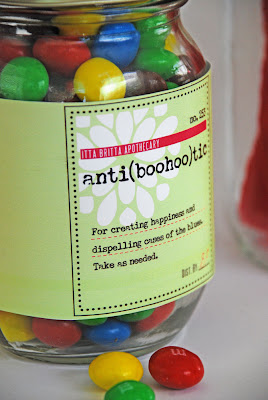
But don't think you have to make your own tomato sauce to make cute labels! Here is a jar of "medicine" to make someone feel better on a blue day. Just add candy! Easy, huh? But totally cute.

This label uses DB Floral Infusion for the white flower, LD Remington Portable for the main text on the label (I thought it gave it a nice old prescription bottle look) and SNF Uptown for some little details (i.e. itta britta apothecary).

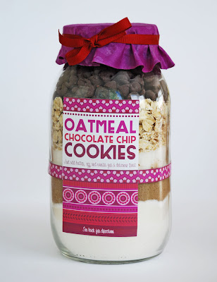
Have you ever seen those cookie recipes in a jar? They are so much fun to give and receive.

I got the recipe for these cookies here. I made this label using mostly DB Karma Borders - I L.O.V.E. this DoodleBat - and for the words I used SNF Duluth Block, SNF Party Script and Party Script Bold. I used the same fonts on the back where I included the directions to finish off the recipe.

Are you totally psyched to make a mason jar project now?

Yes?

Want some help starting out?

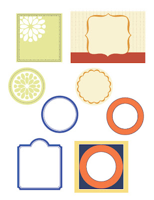
Good. I can offer help... it's a free download! Hurray! There are four labels on this pdf, including round labels for the lid. Pick your own fonts from scrapNfonts to complete the details. (You can click on the image to download the pdf.)
Happy canning! and labeling! and gift giving!

****UPDATE****

Since many of you requested some direction on how to add fonts to the labels I will add a few pointers here. First of all, if you are familiar with a graphic program that uses layers, such as Photoshop, Photoshop Elements, Fireworks, etc, that would be best. You can type on a different layer from the labels and move the type around, change the font, etc, until you get what you want.

If you do not have Photoshop, fear not! This is still a project you can do, you just have to be more patient. If you have Windows chances are you have "Paint." Open up the pdf in Paint and select the type tool (It looks like the letter A in a box). Once you start typing you must do all the editing you will want (font color, size, location, etc) on that particular type box before you do anything else. You can move the type box around while it's selected if you hover the cursor over the edges/corners. When you get an arrow with four heads, click and drag to move the box. The arrow with two heads will resize the type box. Once that type box isn't selected anymore, you can't change it. If you happen to de-select the type box and you don't like how it looks, just hit Ctrl+Z and it will undo whatever you most recently did. You can save and print from Paint, too. Good Luck!

Shop ScrapNfonts.com for the widest variety of craft and scrapbooking fonts, DoodleBats, WordArt and Brushes.

Wednesday, July 6, 2011

This month, Brian helps you get art-savvy with two free photoshop downloads that will help you use text as a design element.
__________________________________________________________________

Font Tip: Add New Meaning
by Brian Tippetts

By now you should know that I love playing with type and letterforms and adding meaning into my designs. In fact, my favorite thing to do while shopping at IKEA is to go to the frames section to see what new posters have been added that only use letterforms for the design. I always seem to come home with a new addition to my collection.

So where did my love for creating designs out of type come from? Well, in my junior year of college, I had an upper level English class that involved a lot of writing. I found myself behind on a number of papers and had to figure out a way to “spruce” up my papers to get the highest possible score. I knew that the teacher’s assistant would be the one grading the papers, so I needed to impress her.

I decided that for my paper written about my favorite subject at that time—surfing, that I needed to add some design flair. I input the text and made it flow in the shape of a wave.

When I got my paper back corrected, the TA had written, “How did you do this?” and “Wow, that’s amazing!” She loved what I had done to the design of the text and I ended up receiving an ‘A’ from that class.

What I learned from this experience is that the story or meaning of the story can be larger than the just the words. Through the design and the words, new meaning can be displayed.


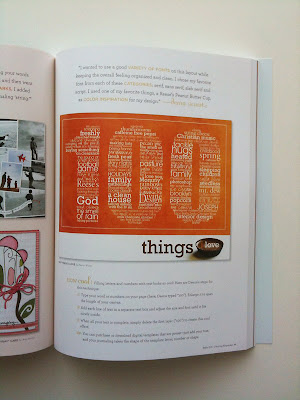
100 THINGS I LOVE

From the moment I received the layout “100 Things I Love” by Deena Wuest for my book, Get Creative with Type, I have wanted to create a layout following her design.


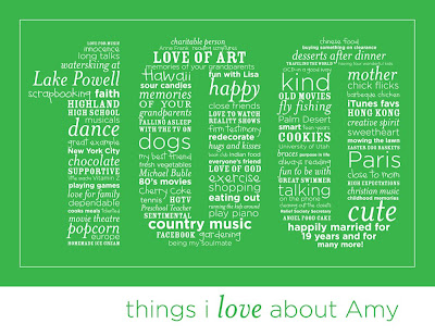
I have been thinking a lot about my wedding anniversary of 19 years in May, so I decided that I would put together a “100 Things I Love About Amy” layout to present to her on our anniversary. After spending hours and hours to come up with the right words and getting it input into Adobe Illustrator (it is also doable in many other programs like Adobe Photoshop, CorelDRAW, and Microsoft Publisher) and playing around with 5 different font and various sizes, I was finally able to put together my own “100 Things I Love” layout.

This was a fun project and as you can see, my results are exactly what I wanted.

Do you want to create a “100 Things I Love” for yourself? Well, I have created a Photoshop template to help you out. You will still need to come up with the list of 100 things for your specific need, but I have shown you two samples to get you started with ideas. You can also change the color and modify anything that you want. The file is saved in layers to make it as easy as possible to use. I am also adding another Photoshop template (with a heart shape) that you can use to add as many (or as little) words, phrases or text to express your thoughts to a loved one. You can download both templates here.

Get started today by adding those sentimental thoughts or words of encouragement to fit in these basic shapes and make it meaningful.

Take care,
Brian


BONUS:
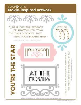
Okay, so I love to talk about the fun things going on here at scrapNfonts. We have a new, deco-art inspired font collection that is now available. SNF Cresota includes the decorative initials and small caps perfect for any title or heading. It can also be used to create a fun journaling block or quote. SNF Duluth and SNF Duluth Block can be used interchangeably for a fun deco-art journaling block or title. I could see this being used to recreate a favorite movie poster or when you want a custom, fresh feel to your card or scrapbook layout. Also included in the bundle is the Geo Deco Outline Doodlebat. The images from this doodlebat can be used easily with any of the Deco-styled fonts. Check these fonts out now and enjoy this month's free art-deco inspired download.

Thursday, June 23, 2011

The lovely Regina Easter, whose delicious projects you might recognize from our design team, hosts her own blog, Bitten By the Bug, with challenges for cricut fans. The projects on that blog are stunning! Well, recently she had her design team incorporate DB Mulberry Lane into one of the challenges. They were fantastic! Check them out here.

ScrapNfonts has also offered to host her next contest, to be announced later this week. Stay tuned to find out more!

Friday, June 17, 2011

Are you all singing "I love, I love, I love my calendar girl..." in your head now? I am.

Ever since the Calendar Super Bundle with the 2010 Calendar brush set was released I've been on a calendar kick!

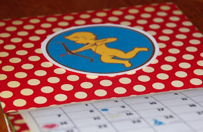
"Anonymous" commented in my last calendar post asking for some direction on making calendars. Well, I am happy to share! Follow along to find out how I made the above adorable calendar. There are three parts to this: The making of the booklet, Creating the calendar and Putting it all together.


The Making of the Booklet


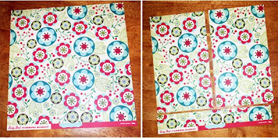
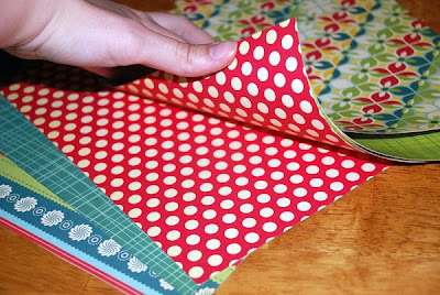
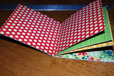
Ok, so this is a fun way to put together a little booklet. I started with double-sided 12" x 12" scrapbook paper. For my calendar I needed 7 pieces of 6" x 10.5" paper. So all I needed was three and a half scrapbook papers cut like I pictured below.


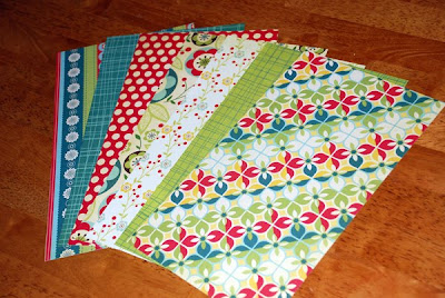
Since it's double sided, it's like I had seven different papers.

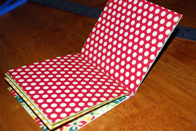
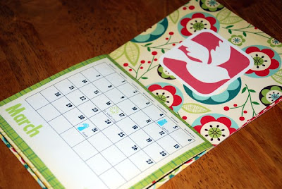
But it's even better than that! Since we're making a booklet, I made sure to flip matching pieces of paper to face each other. I especially wanted February to have the red polka dotted paper.

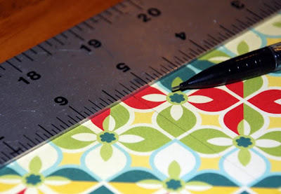
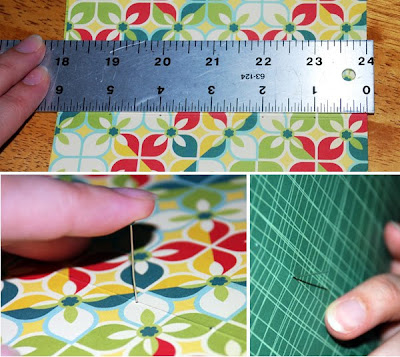
Next I needed to fold each paper in half. I wanted to be precise about it, so I measured exactly 5.25" and penciled in a light line with the help of a ruler.

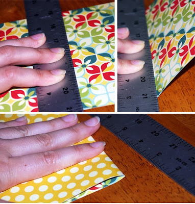
Then I lined the ruler up exactly along the line I drew, held the ruler down firmly with one hand and gently pressed the paper up against the ruler with the other. I folded it exactly along the edge of the ruler so I would have a crisp fold. Once the fold was dented, I removed the ruler and firmly pressed the crease.

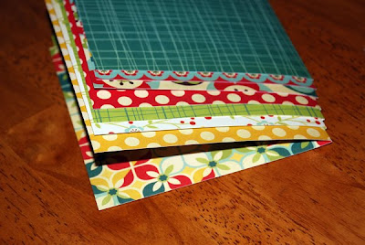
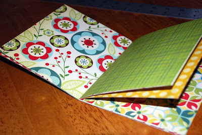
I did that with all seven of my papers, then I arranged them in the order I wanted them for my calendar.

Let's see... cover, January, February...

Perfect. There are my cute little polka dots for February.

If you happen to have an industrial strength stapler, binding these pages together would be quick and easy. Since I do not have an industrial strength stapler (and I rather think I wouldn't use it if I had one because I think the alternative is much cuter and more personable), I'm going to sew the papers together!

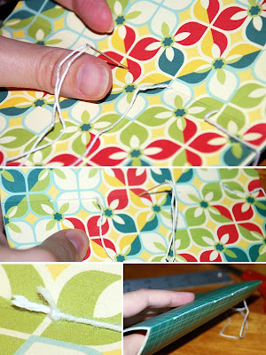
To start, I will draw five little dots, one inch apart, right along the middle crease of the middle paper. After I draw the dots, I'll use a needle and gently push it through all seven papers on the dots to make holes. Watch out for fingers!

Carefully holding all the papers together, I then take a needle and thread it through one way, then back over itself the other way. With five holes I know I'm going to end up with the two thread ends in the same place.

And so I will tie a knot. ("Right over left and left over right makes a knot sturdy and tight" ...no matter how many times I tie a knot, that always goes through my head.)

Isn't this so fun! It's at this point where I get giddy and excited for the possibilities. I play with my little booklet and dream of it's future and think, "When you grow up, you could be a scrapbook or a storybook or an extended greeting card...." Oh right. I'm making a calendar. February, you still there?

Check.

Creating the Calendar

I used Photoshop to make my calendar. If you don't have Photoshop, follow along and you might be able to figure out how to do something similar in a program you have. OR you could just print out the pre-made calendar pngs in the 2010 Calendar Brush set and skip this whole section.

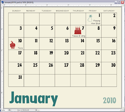
Here we go. First I opened a new file and sized it to size to 5.5" x 4.75" which is the size I want my calendars to be. Then I copied and pasted the blank month calendar template png in the 2010 Calendar brush set and scaled it to fit in my file. Hint: hold the shift key down while scaling the image to keep the proportions consistent.

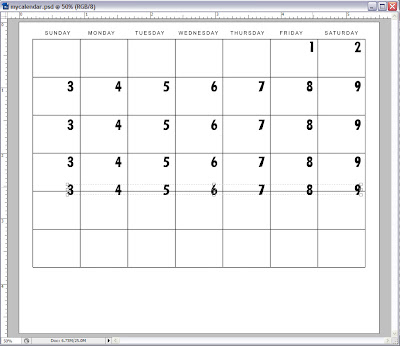
Second, I typed a 1 and made several copies of it so each number was on a new layer. Then I changed the numbers to be in chronological order. To align and evenly space out the numbers, I put the far right and far left numbers approximately where I wanted them, selected all the numbers, hit the "align bottom edges" button, then hit the "distribute horizontal centers" button. (If these buttons are not visible, go to Layer > Align > and you will see these options.)
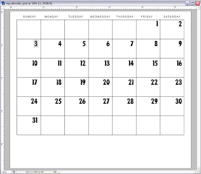
I did that with numbers 3-9 below. Then, after they were evenly distributed, I selected the whole row and while holding the Alt key down, I dragged the whole row down to the next calendar week. Holding the Alt key makes copies. I repeated this until all the rows were filled.

Then I went back and fixed the numbers so they would be right for January.

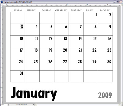
I used LD Little Fishie for my font, but this is totally cute with any of the fonts in the Date It Calendar Super Bundle. I know. I tried them all. It's so hard to decide on a font when you love them ALL. Next I added the month and year.

Whoops! Let's get the year right, shall we? And while I'm at it, I'll add a little color and some holidays and all those birthdays I don't want to forget.

After I save this (as a psd file and a jpg, just to be safe), it's easy to do the rest of the months just by shifting the columns of numbers. There are always seven days in a week, so the columns of numbers never change, just their order in the rows. To print, I opened two months of jpgs in a new document so I could print two on one page. You know, save paper, I'm all economical like that.

Putting it all together

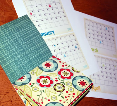
Yay! So exciting! Here is what I have now:

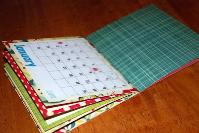
It's time to cut out the calendars and glue them in place.

Oooo. Some of these papers are so pretty, I could almost leave the calendar just like this.

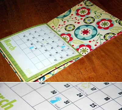
Almost. But gosh darn it, I just love those little DoodleBats, don't you? I put them on all birthdays and holidays and I still don't have enough. I think my calendar needs more. And bigger.

Awesome. Now my calendar is perfect.

Thanks for getting all the way to the end. I hope this helps you get started with you own calendars! (I'm talking to you, Anonymous!)