We celebrate the Sellec, the Little League Coach, the Handlebar, and more. Get DB Disguise Free this week (May 1-6).
Happy stache everyone!
Fonts used in Mustache image:
 Get your free sentiment page, just in time for last-minute valentines! Then show off your stuff and post your projects in the SNF Idea Gallery. Download in your choice of:
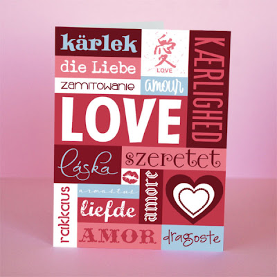 For this card I found how to spell "love" in a bunch of languages. You could also use adjectives to describe your loved one in a card like this.
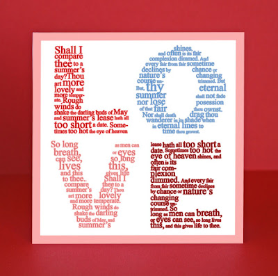 Last Spring, Brian Tippetts gave us another example of this fun way to use fonts, and he included two free Photoshop template downloads to help you.
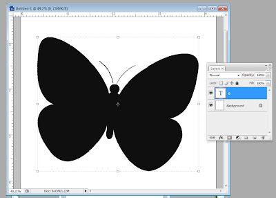 Notice the layers window shows my butterfly as a text layer. For the next step, while your text layer is selected, go to the top menu bar for Layer > Type > Convert to Shape. When you click that, your layers window will look like this:
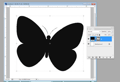 And your DoodleBat/letter will have a line around it, meaning it's selected and it's changed into a shape.
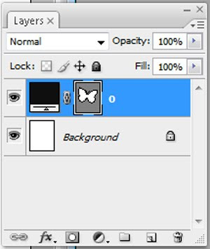 The shape square should have a double line around it. If it does, you're good for the next step. If it doesn't, click the shape square once and that should select the shape. It is important for the shape to be selected for the next step.
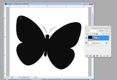 Make sure not to hover the cursor on the edge of the shape or you'll get a different cursor with a diagonal line through it. This cursor will allow you to type on the outside edge of your shape, which is a good tool, but not what we're trying to do here. Here are the two different cursors.
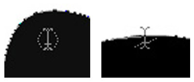 We want the cursor pictured on the left. Click the mouse when you see this cursor, and you can start typing in your shape. Make sure to make your font size smaller and use a font that looks good inside your shape. You may have to play with font size and paragraph alignment to get a look you like. For this card, I used LD Jambalaya.
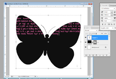 Notice you now have a shape layer and a text layer. If you want to make your shape layer invisible, just click on the little eye next to the layer in the Layers window. The text layer will still type in your shape.
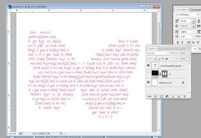 Finally, fit it into your layout, and you're done! Easier than you thought, eh? And totally cool.
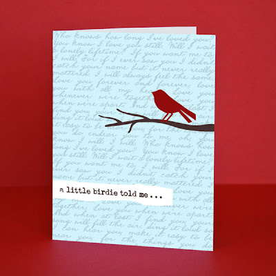 My husband and I have always loved the song "I Will" by the Beatles. By layering the words to that song subtly in the background of this card using LD Abe Lincoln, it introduces another layer of sentiment. The bird is from DB Sweet Spring and the brown font is LD Remington Portable.
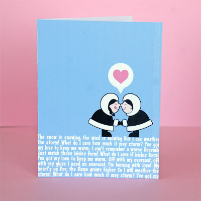 This example uses a block of text as the ground layer for the eskimos. It's not the primary focus, but another fun way to add text and sentiment. The text is LD Advertise This and the eskimos are from DB Eskimo Kisses.
 These Creepcakes are surprisingly easy with the help of some DoodleBats from ScrapNfonts and some chocolate. Yumm.
 You can also use any of the Jack-o-Pattern DoodleBats if you remember to use the negative of the image as your template. It helps me to draw a circle around the outside of the image, then I use the white shape as my guide.
 I used chocolate chips, but on a hot day the chocolate may not set firmly. Chocolate almond bark would probably work better.
 Melt the chocolate. I just did mine in the microwave for 20-30 second intervals, stirring in between just until it was smooth. You don't need very much chocolate, I used about half a cup and had extra. A little goes a long way.
 Spoon the melted chocolate into the corner of the ziplock baggie. Try to gently deflate some of the air out of the back before you zip it shut.
 Take a sheet of wax paper and lay it over your DoodleBat printout. You should be able to see the DoodleBats underneath it. Now carefully snip a tiny piece of the corner off of the ziplock baggie. If it seems too small a hole, you can always cut more. Hold the baggie like a frosting piping bag, and carefully trace the DoodleBat images in chocolate.
 Make sure the images you are making in chocolate are thick enough to stand on their own. I went over some of my more fragile looking chocolate lines twice just to make sure they were thick enough.
 I really liked the skulls, the spider web, and that funky spooky tree, so I made multiple copies of them by shifting my DoodleBat printout underneath the wax paper.
 Make more copies than you think you will need and plan for a couple casualties.
 I love the final look!
 These creepcakes will be a scream at Halloween gatherings!
 I love these little pirate flags. All three of them are in DB Pirate (the sneak peek product for this month).
 The creepy printed decor can work as a cupcake wrapper, too. You can make your own with fonts and DoodleBats (the one below features LD Jambalaya) or LetteringDelights.com has a lot of pre-made cupcake wrappers to choose from.
 Whatever you do, make it fun, make it crafty, and make yourself a Happy Halloween!
 What sparked this obsession you may wonder? It was the discovery of iron-on transfer paper that I can print out from my own printer!
 If you haven't used this, you may be as skeptical as I was when I first saw it. Psh, that won't last through one wash! It will peel and crack and look TACKY. That's what I used to think. I'm here to tell you if you do it right, it will last and can look awesome.
 First rule: before you print your design onto the transfer paper, make it a mirror image because you will be ironing it face down. Most design programs will let you do this or your printer may have a reverse or mirror image setting.
 Here is when the nit-picky details make a difference. First, drain all the water from your iron and let it heat up for 5 minutes to evaporate any moisture. Don't take out your ironing boards. These transfers need a hard flat surface that can trap the heat between the iron and the surface. The instructions recommend veneer or laminate countertops covered by a pillowcase. I can do that.
 Iron the pillowcase and your shirt (or fabric if your not doing a shirt) to make sure they are flat and free from moisture.
 Push hard on your iron, with two hands, and slowly move the iron back and forth, up and down over your paper. Pay close attention to the edges. Make sure they get lots of heat and pressure. It should take 1-2 full minutes of slow pressured ironing to make sure you've got it.
 Let your shirt cool for about two minutes and then carefully peel back the paper and reveal your creation! This is the exciting part.
 Woo Hoo! It worked! (I haven't had it fail on me yet, but it's still exciting every time it works.)
 Just so you know I'm not just making this obsession up, here is a sampling of some of the shirts I've made in the past few months.
 I've burned through at least two packages of transfer paper. Good luck, and beware. It's funner to make these than you may think, and oh so easy.
 Font Tip: Let's Play


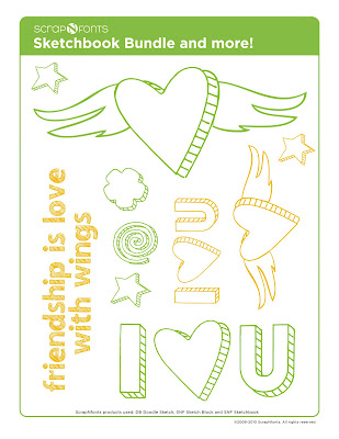 Well, I hope you are excited as much as I am about this new “sketch” collection of fonts. As you can see from this layout by Merrilynne Harrington, they are a blast to use and really add a touch of playfulness to any scrapbook, card or papercrafting project.